A couple of conversations in the last week or so has highlighted the importance of effective communication if you want anyone to take notice of the project information you have carefully gathered and analysed. Good data, good analysis and good information are useless if no one gets the message.
Far too many project controls professionals and project managers think they have done their job once the data has been gathered, analysed and the information developed to facilitate an informed decision. They forget that what they know and understand is of little value in itself - what matters is what busy decision makers understand and use to inform their decisions.
Certainly the underpinning of any useful communication is good data and good analysis but this is only the underpinning. The key to successful communication is the way the information is presented and communicated. Let’s look at one simple example. Which of these graphs indicate a major issue on the respective project requiring urgent management attention?
[[wysiwyg_imageupload:2556:height=224,width=500]]
Graph 1
[[wysiwyg_imageupload:2557:height=153,width=500]]
Graph 2
Most people would see the project represented by ‘Graph 1’ as being a bit behind but not too bad. Whereas the project represented by Graph 2 is in trouble with a trend that is negative and getting worse.
In fact both of these charts were printed from the identical set of data loaded into an Excel spreadsheet. Graph 1 is cumulative, Graph 2 measures the difference between the EV and Budget curves. Which chart is better if you want to persuade a senior executive to give you more resources?? The information is identical, the presentation change the message significantly.
Communicating for effect, using the right type of presentation, requires a good understanding of the recipients of the information. Are they accountants, typically used to analysing spreadsheets, or are they ‘big picture’ people who want to see the overall situation before sending off a subordinate to dig into specific details? A presentation like this works for only one of these two stereotypes:
[[wysiwyg_imageupload:2558:height=382,width=600]]
Now take a look at this Milestone chart:
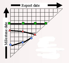
Which milestone is better the ‘red’ or the ‘blue’? Most people see the blue as good (trending up) and the red as bad (trending down) - in fact the ‘red’ milestone will be achieved earlier then planned, the ‘blue’ milestone significantly later (the ‘blue’ was originally planned to complete at report date #3, it is now not expected to finish until report 5).
Printing off a standard project controls chart with ‘all of the information’ usually serve only to confuse the recipient. Effective report design is an art form focused on communicating the right information in the right way so the recipient understands what’s being communicated. This requires:
- Selecting the right information to communicate at the right level of summarisation or detail.
- Selecting or designing the right forms of communication; both the presentation format and the way the information is delivered to the recipients.
- Checking to make sure the communication worked and the information was understood.
There is also a significant ethical component to effective communication. The techniques discussed above can be used to hide information and distort information as easily as they can be used to clarify the important information in the mind of the receiver. Good project managers act ethically and don’t play politics.
If this article has made you think about communication, you may find some of the materials at: http://www.mosaicprojects.com.au/PM-Knowledge_Index.html#PPM07 useful in lifting your communication effectiveness.